Event
Connect 2026
For Connect 2026 in Palm Springs, I led the visual direction for Ericsson’s first event bringing together partners and internal sales teams. I developed the event’s visual theme from the ground up, ensuring it stayed true to the Ericsson brand while feeling elevated, modern, and immersive. I designed every asset across digital, web, and print, creating a cohesive visual system that carried through the entire experience. From large-scale event graphics to supporting materials, the design reinforced the theme Powering Possibilities and translated Ericsson’s vision into a clear, engaging environment that reflected both the energy of the event and its desert setting. The result was a unified event identity that supported storytelling, encouraged connection, and visually tied together keynotes, breakouts, and shared spaces. The work focused on clarity, consistency, and impact, giving the event a strong visual foundation that supported alignment, collaboration, and inspiration.
Year :
2026
Industry :
Telecommunications
Client :
Ericsson
Project Duration :
10 weeks
POWERING POSSIBILITIES
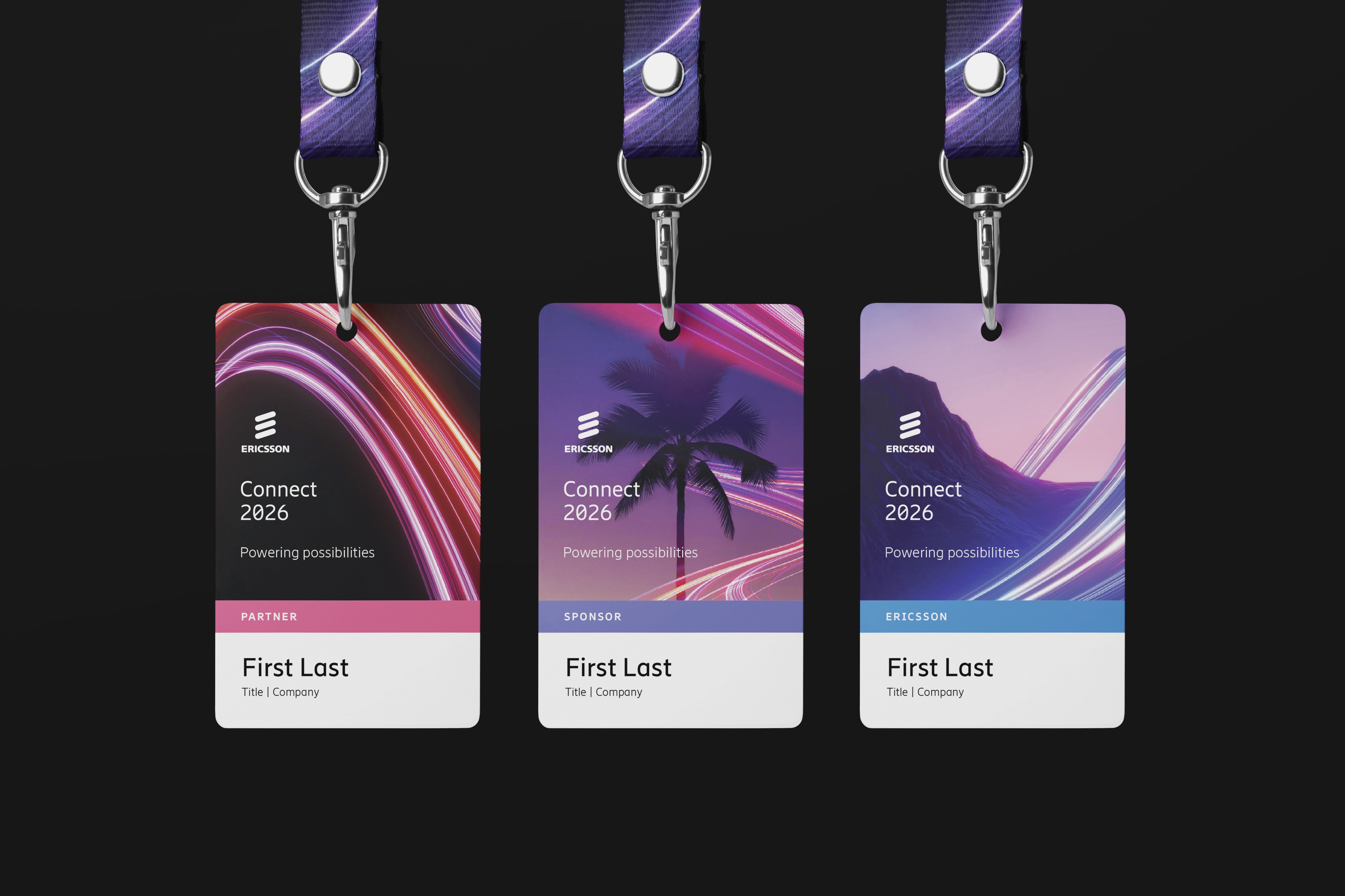
The visual system I created for Connect 2026 was built around a light streak motif to represent energy, momentum, and connection, reinforcing the theme Powering Possibilities. The light became a flexible design element that could scale from subtle accents to bold, immersive visuals across the event.
The color palette pulled inspiration from the Palm Springs location, blending warm desert tones with vibrant highlights to create something that felt both energized and place-aware while staying rooted in the Ericsson brand.
To add depth and versatility, I designed the system across three distinct layers of use. This layered approach allowed the design to adapt across moments, audiences, and formats while maintaining a cohesive visual language throughout the event.

VISUALS THAT CARRY THE MESSAGE
The visual system was flexible enough to communicate on its own across different applications. One example is a set of daily playlist graphics created for each day of the event, using music titles to hint at what was coming and set the tone ahead of time. Inspired by Spotify-style daylists, these graphics offered a playful way to promote the daily agenda while staying visually aligned with the overall event identity.
Rather than relying on heavy copy or overt messaging, the design allowed the idea behind Powering Possibilities to come through more subtly. Even lighter moments like these playlists reinforced the energy, momentum, and sense of anticipation around the event, showing how the visual language could adapt to different contexts while still feeling intentional and on brand.

WAYFINDING BANNERS
Retractable banners were used throughout the venue to guide attendees and provide clear wayfinding. Most banners feature the black background with the light streak layer 1, keeping text and information easy to read and visually consistent.
For signage placed outside in the bright, sunlit Palm Springs environment, I adapted the design using layer 2 with lighter landscape imagery. This ensured the graphics felt integrated with the surrounding environment while maintaining legibility and a cohesive visual identity.

SPONSOR HUB ROOM
The sponsor hub featured 14 individual sponsor booths, each with a TV screen and branded tablecloth. I incorporated the light streak motif and subtle Palm Springs-inspired imagery across the booths, creating a warm, inviting environment that felt bright and cohesive.
This required designing numerous print files and careful planning to ensure consistency across all sponsor spaces. The image shown is a rendering of the hub, with on-site photos coming soon after the event to show the final installation in action.

More Projects


Event
Connect 2026
For Connect 2026 in Palm Springs, I led the visual direction for Ericsson’s first event bringing together partners and internal sales teams. I developed the event’s visual theme from the ground up, ensuring it stayed true to the Ericsson brand while feeling elevated, modern, and immersive. I designed every asset across digital, web, and print, creating a cohesive visual system that carried through the entire experience. From large-scale event graphics to supporting materials, the design reinforced the theme Powering Possibilities and translated Ericsson’s vision into a clear, engaging environment that reflected both the energy of the event and its desert setting. The result was a unified event identity that supported storytelling, encouraged connection, and visually tied together keynotes, breakouts, and shared spaces. The work focused on clarity, consistency, and impact, giving the event a strong visual foundation that supported alignment, collaboration, and inspiration.
Year :
2026
Industry :
Telecommunications
Client :
Ericsson
Project Duration :
10 weeks
POWERING POSSIBILITIES
The visual system I created for Connect 2026 was built around a light streak motif to represent energy, momentum, and connection, reinforcing the theme Powering Possibilities. The light became a flexible design element that could scale from subtle accents to bold, immersive visuals across the event.
The color palette pulled inspiration from the Palm Springs location, blending warm desert tones with vibrant highlights to create something that felt both energized and place-aware while staying rooted in the Ericsson brand.
To add depth and versatility, I designed the system across three distinct layers of use. This layered approach allowed the design to adapt across moments, audiences, and formats while maintaining a cohesive visual language throughout the event.
VISUALS THAT CARRY THE MESSAGE
The visual system was flexible enough to communicate on its own across different applications. One example is a set of daily playlist graphics created for each day of the event, using music titles to hint at what was coming and set the tone ahead of time. Inspired by Spotify-style daylists, these graphics offered a playful way to promote the daily agenda while staying visually aligned with the overall event identity.
Rather than relying on heavy copy or overt messaging, the design allowed the idea behind Powering Possibilities to come through more subtly. Even lighter moments like these playlists reinforced the energy, momentum, and sense of anticipation around the event, showing how the visual language could adapt to different contexts while still feeling intentional and on brand.
WAYFINDING BANNERS
Retractable banners were used throughout the venue to guide attendees and provide clear wayfinding. Most banners feature the black background with the light streak layer 1, keeping text and information easy to read and visually consistent.
For signage placed outside in the bright, sunlit Palm Springs environment, I adapted the design using layer 2 with lighter landscape imagery. This ensured the graphics felt integrated with the surrounding environment while maintaining legibility and a cohesive visual identity.
SPONSOR HUB ROOM
The sponsor hub featured 14 individual sponsor booths, each with a TV screen and branded tablecloth. I incorporated the light streak motif and subtle Palm Springs-inspired imagery across the booths, creating a warm, inviting environment that felt bright and cohesive.
This required designing numerous print files and careful planning to ensure consistency across all sponsor spaces. The image shown is a rendering of the hub, with on-site photos coming soon after the event to show the final installation in action.
More Projects
Event
Connect 2026
For Connect 2026 in Palm Springs, I led the visual direction for Ericsson’s first event bringing together partners and internal sales teams. I developed the event’s visual theme from the ground up, ensuring it stayed true to the Ericsson brand while feeling elevated, modern, and immersive. I designed every asset across digital, web, and print, creating a cohesive visual system that carried through the entire experience. From large-scale event graphics to supporting materials, the design reinforced the theme Powering Possibilities and translated Ericsson’s vision into a clear, engaging environment that reflected both the energy of the event and its desert setting. The result was a unified event identity that supported storytelling, encouraged connection, and visually tied together keynotes, breakouts, and shared spaces. The work focused on clarity, consistency, and impact, giving the event a strong visual foundation that supported alignment, collaboration, and inspiration.
Year :
2026
Industry :
Telecommunications
Client :
Ericsson
Project Duration :
10 weeks
POWERING POSSIBILITIES
The visual system I created for Connect 2026 was built around a light streak motif to represent energy, momentum, and connection, reinforcing the theme Powering Possibilities. The light became a flexible design element that could scale from subtle accents to bold, immersive visuals across the event.
The color palette pulled inspiration from the Palm Springs location, blending warm desert tones with vibrant highlights to create something that felt both energized and place-aware while staying rooted in the Ericsson brand.
To add depth and versatility, I designed the system across three distinct layers of use. This layered approach allowed the design to adapt across moments, audiences, and formats while maintaining a cohesive visual language throughout the event.
VISUALS THAT CARRY THE MESSAGE
The visual system was flexible enough to communicate on its own across different applications. One example is a set of daily playlist graphics created for each day of the event, using music titles to hint at what was coming and set the tone ahead of time. Inspired by Spotify-style daylists, these graphics offered a playful way to promote the daily agenda while staying visually aligned with the overall event identity.
Rather than relying on heavy copy or overt messaging, the design allowed the idea behind Powering Possibilities to come through more subtly. Even lighter moments like these playlists reinforced the energy, momentum, and sense of anticipation around the event, showing how the visual language could adapt to different contexts while still feeling intentional and on brand.
WAYFINDING BANNERS
Retractable banners were used throughout the venue to guide attendees and provide clear wayfinding. Most banners feature the black background with the light streak layer 1, keeping text and information easy to read and visually consistent.
For signage placed outside in the bright, sunlit Palm Springs environment, I adapted the design using layer 2 with lighter landscape imagery. This ensured the graphics felt integrated with the surrounding environment while maintaining legibility and a cohesive visual identity.
SPONSOR HUB ROOM
The sponsor hub featured 14 individual sponsor booths, each with a TV screen and branded tablecloth. I incorporated the light streak motif and subtle Palm Springs-inspired imagery across the booths, creating a warm, inviting environment that felt bright and cohesive.
This required designing numerous print files and careful planning to ensure consistency across all sponsor spaces. The image shown is a rendering of the hub, with on-site photos coming soon after the event to show the final installation in action.